
LLAOLLAO N.1 in Frozen Yogurt.
Frozen yogurt like it or don’t like it is definitely to be tried at least once in your life.
Days ago I was walking through the streets of Paris and I noticed a small store called Llaollao,
at the beginning it seemed to me one of the many ice cream stores and I was struck by the green color so bright and the minimalist and modern furniture convinced me to enter.
I immediately thought of a Swiss brand because of the rigorous and clean graphics typical of the Swiss style of which the relevant points are clarity and legibility, but after careful research I discovered with great surprise that it was a Spanish brand.
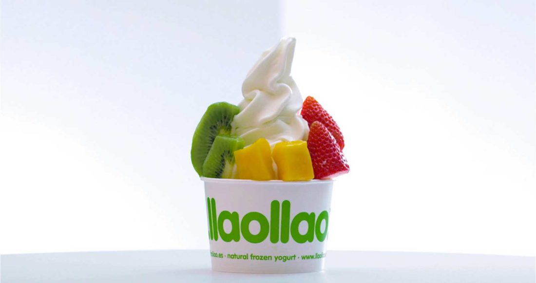
This brand involves and invites the customer to consume the yogurt that is served in the store with fresh seasonal fruit and cereals as well as crispy and delicious sauces that makes it tasty and delicious.
BRAND IDENTITY
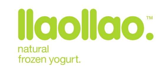
The Colours and Font
The graphic identity is dominated by the bright, vivid green colour, a shade closely linked to the Lime fruit.
A creative choice targeted because the green Lime is a young color, sparkling, cheerful and perfect for communicating lively and energetic environments. In this case, the vital and nutritive energy of the product.
Green is also nature and what could be more authentic, true and sustainable than nature?
The other important colour of the brand is white, which dominates the whole store, even if I consider it a “passepartout colour” shade that goes well with all colours but in this case, together with green, they are the perfect expression of freshness and vitality. Communication is green eating, green living, eco-friendly … etc..
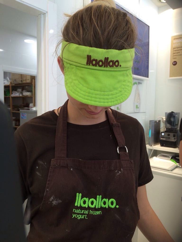
The third colour, brown, no less important than the others, is present in the furnishings and uniforms.
Brown is the colour of nature, of the earth and of the trees and therefore it communicates us eco-sustainability and an organic and genuine product. Brown, together with the other colours, creates a perfect harmony and balance of light, creating a store that is also elegant.
About the font is a Sanserif perhaps rounded very simple and readable. The logo Green on white
is very readable and in the negative version stands out on the green vibrating.
The packaging (the cup), the external sign and all the other applications are very simple and clean as well as the whole brand identity but maybe this is the winning key of this brand the simplicity and the return to the authentic and simple things without too many graphic elements, patterns o textures and superfluous things.
The visual identity is winning because it is simple and as a great master of Italian design Bruno Munari says ….
“Complicating is easy, simplifying is difficult.
To complicate just add everything you want: colors, shapes, actions, decorations, characters, environments full of things. Everyone is capable of complicating. Few are capable of simplifying.
(Bruno Munari)
In 2013, llaollao was chosen as one of 12 best business concepts of the year by the Sandwich & Snack Show Academy and presented the Best Newcomer award by the Actualidad Económica magazine, Spain’s leading publication in the fields of economics and business. Ilaollao has opened over 100 stores in Spain. Today, Llaollao has reached over 220 stores worldwide… There will be a reason…
Look at the website!
https://www.llaollaoweb.com
The brand identity was designed by Panamera Branding Consulting
http://panamera.co/
Written by Agnese Angelini


No Comments