

Tekoe, 100% natural Tea in Switzerland.
When you think about Switzerland, three things usually spring to mind: chocolate, banks and watches. But Switzerland is also the home of an interesting brand of tea.
Tekoe is Swiss brand that was created in 2002 by two tea lovers who, after having travelled the world over in search of the best tea producers, finally decided to bring their finds back home, to Switzerland. Valérie Peyre & Pierre Maget, co-founders of Tekoe, created this unique brand to share “their pleasure and let clients discover the universe of tea in their urban lives.”
Their points of sale (Tekoe stores) are to be found in the most important Swiss railway stations such as Geneva, Lausanne, Bern, Basle and Zurich. Seminars and conferences are also organized for clients and “tea lovers” who want to know more about tea, or for hotels or service companies desirous of honoring an important client or offering a special service.
CONCEPT
The objective of this brand is to awaken the interest of clients in their everyday and urban lives, and show them that tea is a healthy, modern product with a rich variety of flavors, while revealing the fascinating world of tea plantations and tea production to a global audience.
The stores are only situated in the most crowded and widely frequented stations, where travelers can take a break and enjoy a cup of tea, or take it with them on the train to sip during their journey. The excellent quality tea is 100% natural and there are lots of different varieties to choose from.
IDENTITY
A brand identity that’s striking for its modern, simple look.
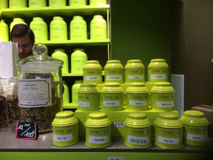
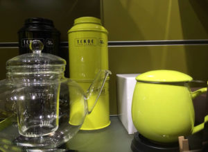
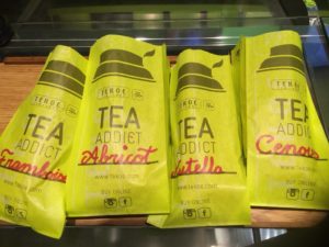
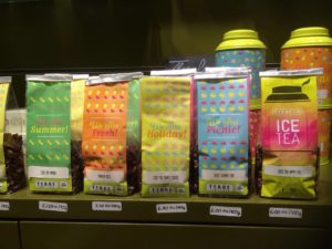
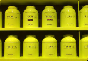
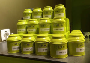
An explosion of bright green that’s present in every corner of the stores thanks to the packaging and aluminum tea caddies behind the counter containing an infinite number of tea varieties.
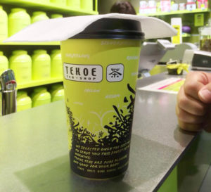
You can drink your tea in the store or ask for one of their takeaway paper cups.
The brand colors are green and black. Green, to reflect the nuance of tea leaves before they are dried and because it is a color that exudes a sense of harmony. Green has a calming effect, while black lends a chic, austere, credible and refined air. TEKOE green is a very bright shade, almost phosphorescent and this makes it extremely modern.
The aluminum caddies lined up behind the counter are all of the same color and style. They reflect an attentive, orderly and contemporary brand identity, but this is what makes it credible since it implies that the strength of the product lies solely in its quality, without the need for fuss and frills. Tekoe stores feature modern furnishings, where light colored wood trimmings make everything warm and welcoming.
SWISS STYLE
This modern, uncluttered look reminds me of the Swiss style of the ’20’s, but still very much present today, even in the tiniest details of modern design, especially in typography.
Being of a “modernist“ nature, Swiss style is easy to spot owing to its boundless simplicity focused on the creation of beauty and purpose.
These two principles are often evident in the use of asymmetrical layouts, grids, sans-serif fonts and simple, but powerful images. These elements are produced in a very simple, but extremely logical, structured, rigid and harmonious.
Drop by if you ever happen to go to Switzerland.
The retail store, brand and brand identity were designed by Zap Design.
http://zap-design.ch/
http://www.tekoe.com/

Written by Agnese Angelini
No Comments